
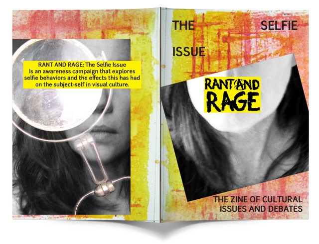
Front cover: Snapchat yellow and angry feminist pink connote the emotions behind the zines brand and the closed mouth covered by the logo visually screams contradiction/ contrast/ as the name is in direct opposition of a closed mouth. The visual hierarchy is very important as the intent is to draw the viewer in using balance and elements with use of space.
The back cover uses the space to communicate the purpose of the zine. The subject is over powered by the mirror and the black and white imagery creates a dramatic effect that is in agreement with the rest of the zine.
The covering of the eyes and mouth and the positioning of the photos are non-conventional which support the youth cultures in which the social applications are targeted. This also targets the countercultures (zine) and artist communityLogotype: Hand painted acrylic on watercolor board, arranged in Photoshop for easy digital manipulation of the text. This gives freedom in layout design and proximity of the letters themselves if required.
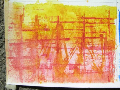
Non conventional materials and methods: Watercolor wash and application using brushes, salt, a spray bottle, and cards made of cardboard. This is an abstract representing city bridges.
Rant and Rage is a zine that started from my research for the Master of Arts program in graphic communication through IDI/University of Hertfordshire. Practice 1 and 2 continue to inform my practice and MA project as phases of portfolio work and research methodologies on cultural issues and debates. Experimentation through practice led research processes aim to resolve design problems that have not been considered in this sector of visual culture.
