
Poster 1 is inclusive of the name of the zine with a subtitle: The zine of cultural issues and debates. The name of the zine is front and center and sitting in it’s right place, over the life source of the image/subject and message without encroaching or confusing the viewer. This promotes the zine and sparks awareness through layers of meaning. Black and white imagery supports the content of the zine and the layout considers visual hierarchy and use of white space.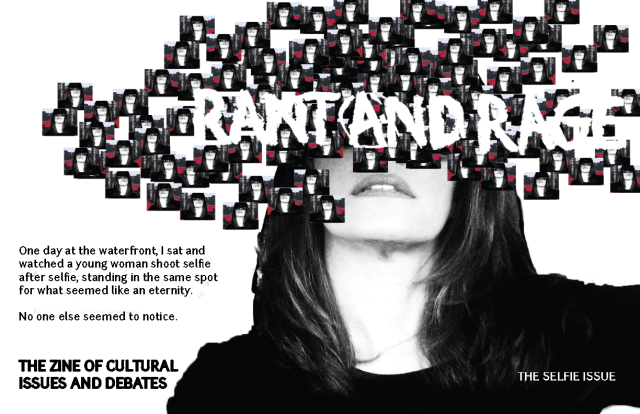
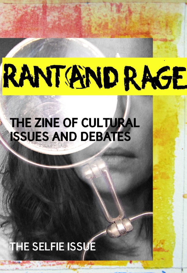
Poster 2 is just more Rock-n-Roll in the style contradicted by the scholarly subtitle. The outcome of this poster screams selfie and social media issues in the color combination, a mixture of Shapchat yellow and Feminist pink with careful consideration of logo placement over the eyes which contradict the image in the mirror and self-disclosure. The text brings awareness while promoting the zine at the same time. The two posters are very different in some aspects, layout, color and orientation yet, connote the same message and are united through black and white selfie photography and text.
Notes:
Poster 1: For more details on materials and design methods, please see SELECTED SPREADS 2ND ISSUE post.
Poster 2: For more details on materials and design methods, please see ZINE COVER DESIGN AND BRANDING post.
