
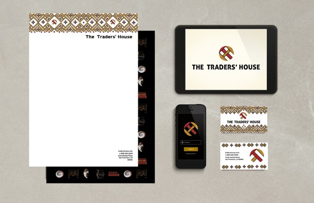
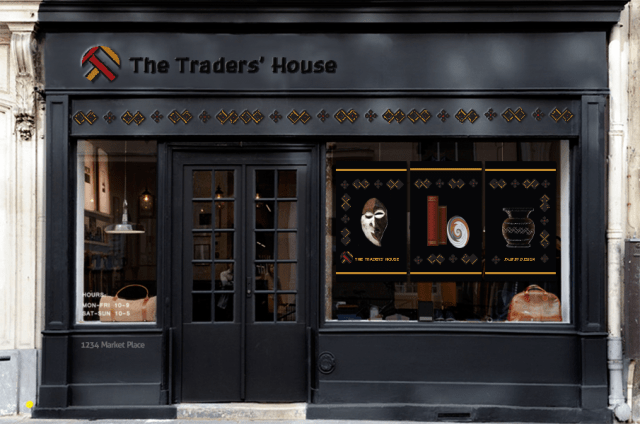
Brand identity
- Logo- development from the research, I wanted to emphasize a hand painted look with rich colors that are recognizable from around the globe. In keeping with the brands standards the logo has been crafted from the letters T and H into a geometric symbol with a monogram style that supports the rich colors and handcrafted items the company carries.
- Type-great consideration was given to the typeface, in the end a humanist sans with a few refinements worked out to be the best fit. The end result is a personalized feeling that the brand necessitates.
- Color-because the company carried products such as textiles, hand woven items, tribal masks, hand crafted jewelry and other hard to find collectibles from around the globe, a rich palette with golden yellows, a deep rich red and a muted earthy purple all equally saturated and grounded with a rich black strikes the best balance for the brand. The palette strives to be as colorful as the many countries the company represents and that most effectively connects the brand’s identity and is able to stand out against the competition.
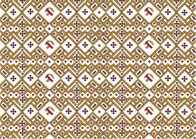
- Pattern design the brand identity isn’t limited to the logo only, and I wanted to effectively link the breadth of peoples the brand represents and the handcrafted items that the company offers to the sub culture that supports fair trade. By creating a pattern from the letters T and H in a 45° angle and interweaving them, visually, it isn’t necessary to look at the pattern and recognize the letters, it is meant to subliminally ground the brand’s identity and values.
- Reminiscent of hand painted signs from different origins around the world, the design appeals to world travelers by the warm rich tones and hand painted effects.

Through research into likeminded companies who represent a global movement of fair trade I was able to gain a number of perspectives into the trends in design and found that most are very simplistic with similar color combinations of red + orange, brown + green+ blue over a variation of jute tones. This created an opportunity to create something that would be strikingly different yet still be as colorful as the many countries the brand represents.
Through my research I was also able to study various forms of type that are commonly used for a global market, in particular an ethical brand and found that most used handwritten fonts. Some blended a painted effect into the type while others leaned toward a woman’s or child’s-hand font family. Again, this opened up the chance to capture the essence of a humanist identity without leaning too much to the handwritten style but was able to hold it’s own against the patterns and monogram style symbol of the logo.
Using rich colors and a humanist sans font is a good way to communicate that the brand is in support of alleviating poverty by creating opportunities for producers and workers who have been economically disadvantaged by the conventional trading system.
The logo is used as a visual way of communicating the main focus of the organization. The colors are as rich as the many countries the companies represent and the fonts are most always a handwritten style of font.
