Experimentation as part of the practice led research process begin with exploration, understanding, and knowledgeable practice, acquired through years of research interest. I have found the longer I practice my field of inquire the more the exploration phase of research benefits from my work.
Logo Design – Typography
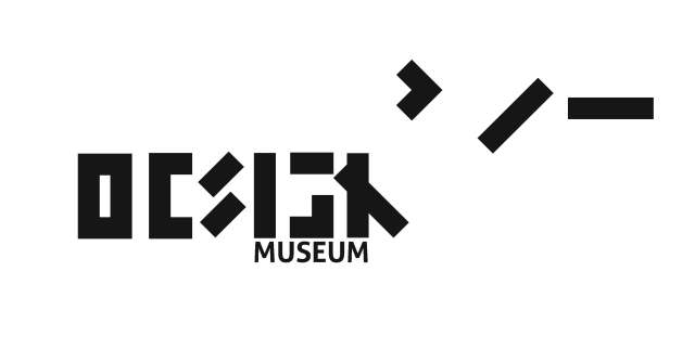
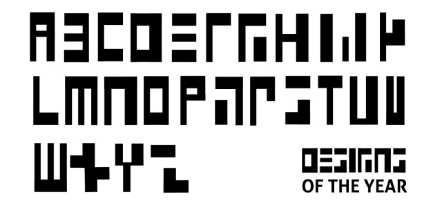
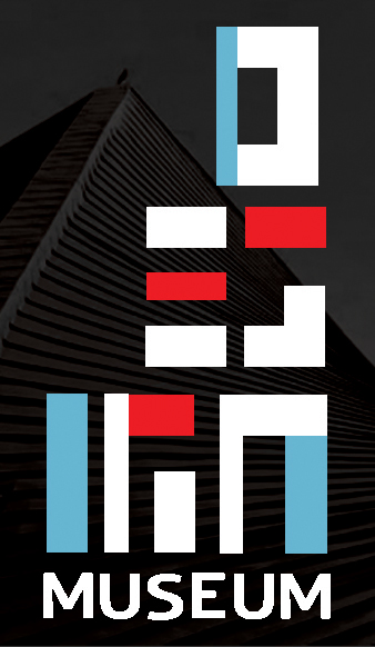
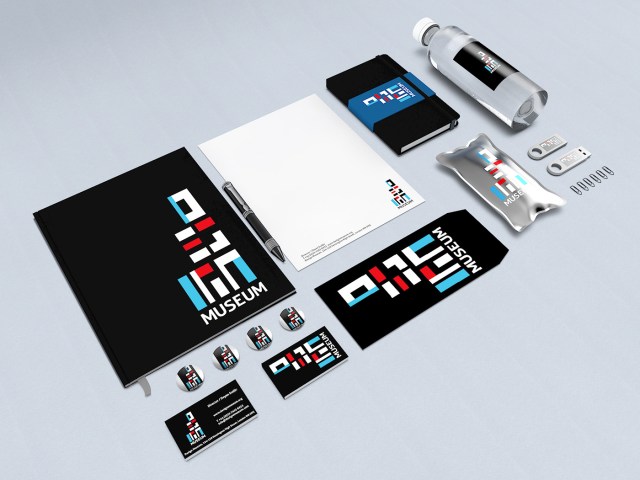
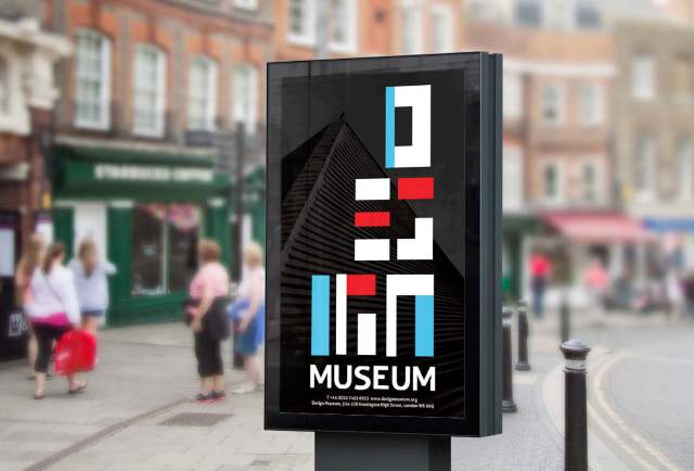
The custom modular type was designed using a limited number of shapes inspired by building blocks. The right justification and the stacking of the letters supports the multi level facility of four floors, as well as the staircase. The type under-neath the modular font is a simple Aller Bold font with and added stroke thickness of two points. Some modifications have been made to the text to further simplify the text and create a linear structure that supports the more complex design of the modular typography.
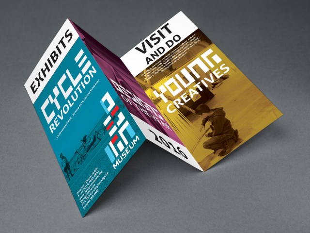
The palette was designed to support modern art while respecting all styles of design. Because the building was redesigned in the 1960s and the new build project is restoring the original building design down to the last detail of matching the glass exterior, I felt a palette of the same period would be most fitting. The split complimentary palette is eye-catching while reminiscent of the time period that has been such a great influence on modern design and architecture. This palette also supports a minimal variety of background colors of yellow, blue and fuchsia for interior exhibit display and directional posters inside the museum.

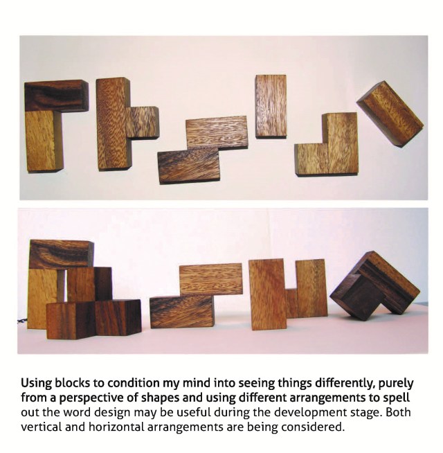
Experimentation and discovery mirrors a critical inquiry within creative process. In this example, I took pieces of a wooden puzzle to form the word design after various attempts using rocks, wire, paint, and string to open my mind to explore new ideas. The outcome after experimentation, revision, testing, and critical reflection resulted in an entire modular alphabet that was used for a logo design and header text for other media throughout the collateral.