
Research and Discovery
One purpose of this examination is to find out how comparative youth countercultures, although short-lived, have influenced social identity systems and how this can be seen in a graphical context.
The elements of interest found in this discovery will be contingent on finding the answers to the following:
- How have different levels of elements that have emerged from these cultures influenced graphic design,
- and with different age groups?
- How have youth countercultures influenced branding in music and fashion?
- Historically, what are the most influential countercultures,
- and what are the code identifiers that can be seen today?
- In what ways are current countercultures influenced by visual identifiers?
Primary and historical research consisted of researching the roots of each subculture exploring the aforementioned list associated within each group. Knowledge of historical and contemporary graphic design, theoretical application and visual language of each group from the research has guaranteed the identities, contrasts, styles and symbolism have worked as intended.
Design Description
Pathway – Urban street art, illustration, vectored art, photography, stenciling, graphic design, ink and markers, typography, digital imposition, layers.
Tone of voice – Current, with a multi-cultural vibe. Fashion has always been a sign, and a system, although a marginal aspect of studies, it has shown itself to be a form of social identity. To insure that the cultural code identifiers were respected, research provided a robust source of information into these fashions and were applied with great attention to detail. What is evident from this form of media are hip hop figures, skaters, hipsters and goth subjects.
Positioning – Lyrical. Symbolic of dance belonging to very definitive cultures all stylized in different movements to communicate motion, emotion, music and the overall identity.
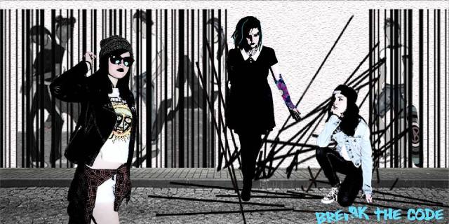
 Figures – The background figures are simplistic and subdued, created to support the action of the figures breaking through the barcode ‘cage’ that is controlling the subjects. They are void of individual expression as evidenced in the fact that there are no facial features but have kept the group social identity with fashion, skin tones, textures and positioning.
The action figures have taken on a form of personal identity as they break free while retaining their cultural code signifiers. This is evident in the facial expressions, fashion, texture, body art, and positioning.
Color Palette – Symbolic of Pop Art. Considering the historiography of youth countercultures where cultural ideals began to reflect the angst of youth against a consumerist culture and the bourgeoisie in the 50s and 60s. Bright colors are also representative of the rainbow – this inclusive of the LGBTO population as well as rave and techo movements.
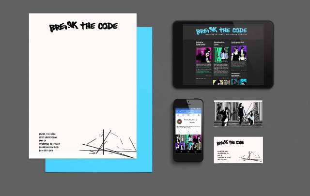
Logo and Font – The logo has one simple break. This supports the message of the project brief without drawing the attention away from the artwork. This is strong enough to stand alone and still be effective. The humanist sans font supports graffiti and urban street art, when used on the mobile applications, a white stroke was added to connote underground zines and comic strip cultures to broaden the audience even further.
Application – The emotional imagery and style in which it is laid. The application is directly inclusive of skater, hip hop, hipster, goth, and punk movements and indirectly inclusive of the LGBTQ population, rave, techo, popular culture and the underground zine and comic book cultures. The mural was comprised of a mixture of different media, the background figures are an illustration using pen and marker while the bar-code ‘cage’ was digitally drawn. The focal point of the work utilized photography for distinct positioning and was digitally stenciled.
Evaluation of Project Outcomes:
In consideration to the outcome, a semiotic approach was taken to determine visual symbols in order to signify the appropriate messages were communicated to the audience.
Observations are noted as follows:
The mural – the barcode is a strong supportive piece that connotes the message without competing with the design. A balance has been achieved with the desaturated background figures and barcode where they work together in supporting the action of ‘breaking through’ and the predominate figures to be showcased.
Through the creation of profiles where the attitudes, behaviors and overall appearance were noted, the visual representation of the subjects was arrived through a process of deliberation and argument but ultimately, I believe it was the rebellious thoughts that triggered the project’s success. Thoughts like “what if I did do this?” or “what if I supposed this wasn’t true?” a methodology inspired by Milton Glaser that got me to the point of achieving the best design solution.
References:
Milton Glaser – Using design to make ideas new [online] https://www.ted.com/talks/milton_glaser_on_using_design_to_make_ideas_new [accessed 11-01-2016]
Misiroglu, G. (2015) American Countercultures: An Encyclopedia of Non Conformists, Alternative Lifestyles, and Radical Ideas in U.S. History. New York.Routledge Books Available at: https://www.amazon.com/American-Countercultures-Encyclopedia-Nonconformists-Alternative-ebook/dp/B00VA3W28O/ref=pd_ybh_a_1?_encoding=UTF8&psc=1&refRID=MWB4R2JHY2EZ9RH1VC4Y [accessed 11-15-2016]
